Am I an Artist?
I used to say that I wasn’t an artist, I just played one on TV.
I don’t think I wanted to be pressured into the “artist” mold, but eventually, art saturated everything I did and I finally had to admit, “I am an artist.”
The Signs
Looking back, there were signs, of course. And not just your typical signs. Sure, I drew a lot of pictures, but there was more sinister evidence.
It started in grade school. More than once art projects I completed went missing (read “stolen”), or got lost (as I’d say nowadays, “went walkabout”).
Two memorable incidents stand out.
The Name
There was the time we were supposed to make name signs for our desks for parents’ night at the school. Working on those name signs took a hefty portion of the hour. I had filled the white space around my name with several colorful outlines.
I was quite pleased with it, but the next day it was nowhere to be found and I had nothing to show on parent’s night. (This particular loss disturbed me the most because at the time I believed I couldn’t duplicate that beautiful artwork.)
The Sculpture
Then there was the time we were assigned to make sculptures out of clay for our Mayan culture unit. This was probably in middle school. I made this pretty neat 10″ tall Mayan warrior complete with a tunic and ornate helmet. He had to be left overnight for drying.
But the next day… he was gone.
I’m sure something that size wasn’t “accidentally misplaced”.
A Little Anecdote
I once had a teacher in school who had his work claimed by another (I’m not exactly sure how that worked). However, my teacher had painted secret things into all of his paintings. When presenting his claim before the court, he would take the judge aside and show him the secret images. It was damning evidence indeed when the interloper couldn’t explain what the symbols were.
Alas, this is an ability I don’t possess.
Congratulations, You’ve “Made” It
But in the long run, I guess that’s how you know you’re successful – when people start stealing your art!
I’m not sure how I would feel of my art getting stolen now. In the digital realm, art is stolen all the time. Sometimes innocently enough but oftentimes maliciously.
Is This What Success Feels Like?
Will I feel I had reached some level of success when my art is stolen? (Notice I didn’t say “if”.)
Maybe, but I doubt it. I think I would feel the same as when I was a child: confused and a little hurt.
Digital theft of your artwork is impossibly hard to pursue and rectify to the point where I’ve been told it’s not really worth it.
Still you can’t help pursue your calling in life.
Here’s a little progression gallery of the painting I did for this post:
“Reflection” – oil on foamcore, 5×7


Today’s artful remedy is a little different that normal, but just as likely to bring a smile to your face. It’s an exerpt from my husband’s in-progress book, Life Rules for Nerds: Starting with the Slide Rule.
-Written by Mike Nashadka, the Head Geek In Charge at The Man.
Confessions of an Engineer
Full disclosure: I am a software engineer. Some people believe that software engineering doesn’t count as a real engineering, and those people are idiots.
But that’s not important right now. What was I talking about? Oh, yeah – engineers and art.
A couple of decades ago, on a triple dog dare, I married an artist.
This was a huge win for me, according to my wife.
I have always been fascinated by her (being an artist . . .well, for being a woman too, but that’s not what we’re talking about).
Artists do strange and fascinating things.
My wife spends tons of time on things that I would never spend time on.
For instance, she used to regularly dye her hair a beautiful fiery red. Not like your average orange/red hair – more like she happened to be standing under some person who just started bleeding red. It was not her real hair color, but she chose to spend time on this to make herself “different”. (I’m guessing.)
(There may also be some canoodling about with paint and brushes, but I’m not sure.)
Different is not always a good thing to engineers.
We are singled out from basically birth for being different – not only is our pocket protector a different color, but we are the only ones wearing pocket protectors.
And apparently having your name on your underwear is not a good thing to your peers.
I never really understood why people need their names in their underwear.
How often do you really get your underwear mixed up with other people’s underwear? Is that the “secret” during the annual holiday “Secret Santa” gift exchange? Is underwear passed around like fruitcake?
There are also some fascinating personal characteristics that all artists share.
Based on my extensive research of the many people that I happen to be married to who are professional artists, their attention spans are ridiculous.
My wife will ask me a question and stop paying attention to the answer before she has finished asking the question. It’s like she is a dog, and she saw a squirrel. But she’s the only one that saw the squirrel . . . because it doesn’t exist.
Also, no surface is safe.
We have four couches in our house (for reasons that I’ll never understand because there are only four of us). Three of us regularly have to sit on the floor because she likes to spread her stuff out to take up the maximum possible surface area.
As I was writing this, I went to the bathroom (I’ll spare you the details this time), and now I have to finish this post standing up.
The point . . .
The point I was trying to make at some point, probably, is that art fascinates us (engineers that is). We are typically very utilitarian in nature, and art is usually about non-utilitarian as you can get.
For instance, I remember watching a concert on TV in the late 1980s because I didn’t have a date that night (or really any night for that decade) and the woman that was singing changed her clothes about 10 times during the maybe 13 songs that she sang.
Those outfit changes are about the only thing less utilitarian than oil paintings. (And it also seems like she really could use her name written on her underwear.)
The fact that people spend so much of their time and effort into making something so beautiful for themselves (and possibly others) to enjoy is amazing.
However, engineers are not likely to be the biggest consumers of art.
Part of us just doesn’t get it. We like art that is easily recognizable and doesn’t take a lot of interpretation.
When I look at paintings by impressionists, such as “Starry Night” by Vincent van Gogh, I can’t help but think that it was really painted by a child and fingers were involved. I don’t really get that.
We also are well-known for having slightly twisted (read: “dorky”) sense of humor, so art with derogatory statements about Microsoft (they typically deserve it) is more our on our level.
Thankfully We’re Not All Engineers.
With all being said, we really appreciate what the artists do. We can’t do it. It’s not our thing. I’m glad that somebody makes the world more beautiful because I don’t know how.
As Christmas quickly approaches, I decided a visual feast to celebrate the season was in order.
[bctt tweet=”Merry Christmas in images!”]
Most pieces I’m sharing originated in the Renaissance owing to the fact that as culture emerged from the Dark Ages there was an explosion of religious art. This period, also called the Age of Faith, was so dominated by the powerful influence of the Christian church, church leaders had even more power than kings (a big reason behind America’s separation of church and state).
It was the Church that financed most religious art. Kind of like the world’s first propaganda campaign. While most artists were very limited in their subject matter, they were still allowed to inject their own style, creativity, and symbolism.
(For a few select images, prepare to be dazzled by the Google Art Project’s amazingly high-resolution photos which allow you to zoom in on every brush stroke and crack.)
1. Madonna and Child with Saints John the Baptist and Girolamo by Piccinelli
You can view this at the Google Art Project!
“Madonna with Child and Saints John the Baptist and Girolamo” by Andrea Piccinelli (1486-1524). Google Cultural Institute. Licensed under Public Domain via Wikimedia Commons.
What initially drew me to this painting was the unapologetic support for the breastfeeding movement. Woo hoo! I wonder if it caused as much controversy back then as it does now. Probably not.
The second thing I noticed is John the Baptist (commonly identified in paintings by the cross he holds) who appears here as an old man. Curious. Being only six months older than Jesus, most painters depict him as a child when pictured alongside the baby Jesus.
At first, I was confused about Saint Girolamo since the only one I could find wasn’t made a saint until 1767 (this painting was made around 1500). Finally, I figured out he’s Saint Jerome sometimes known as Girolamo.
Now take a closer look with the Google Art Project at the rock Saint Jerome is holding and you’ll notice what looks like blood. I couldn’t find any information on this symbolism, but my husband suggested it was the rock used to circumcise Jesus. Eeh. *See Luke 2:29. 🙁 If you have a better suggestion, please let me know.
2. The Virgin and the Child or Madonna of the Book by Boticelli
Look at the filigree on the Google Art Project!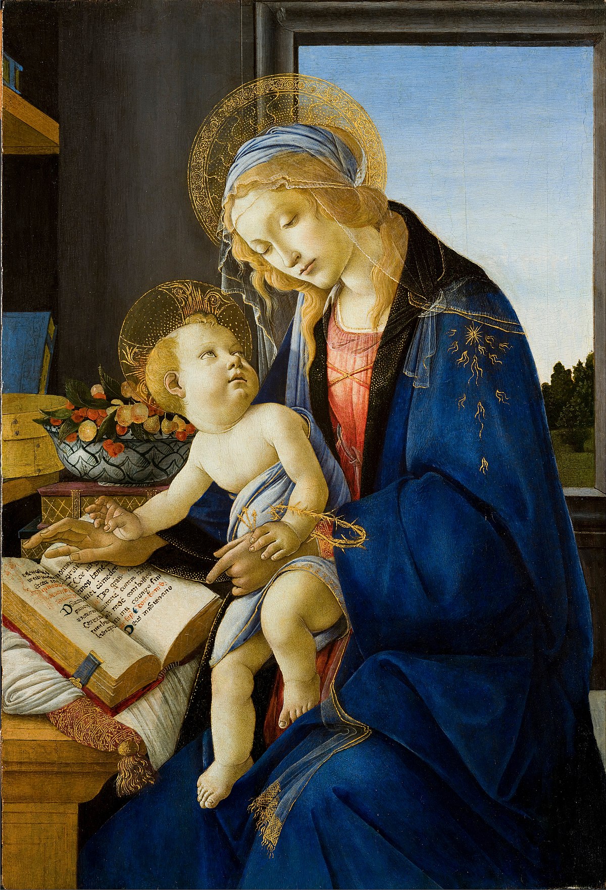
“The Virgin and Child (The Madonna of the Book)” by Sandro Botticelli. Google Cultural Institute. Licensed under Public Domain via Wikimedia Commons.
This one caught my eye because of the brilliant blue of Mary’s cloak. At the time, blue of this intensity was made from the expensive stone Lapis Lazuli so it was reserved for the most important figure. Mary was quite often identified by this blue.
This painting abounds with symbolism: the cherries represent the blood of Christ, the plums are the love between Mother and Child, and the figs symbolize the Resurrection. I was intrigued by the emblem on Mary’s sleeve, but it’s meaning is left up to the viewer.
If you take a moment to look at the painting in the Google Art Project, you can get a good look at Christ’s hand. On his wrist is a golden crown of thorns alluding to his Crucifixion. In his hands are three little arrows. I was a bit confused here until it’s explained that these are nails. Clever.
3. Mary Enthroned with Child by Fabriano
See it in the Google Art Project!
“Mary Enthroned with the Child, Saints and a Donor” by Gentile da Fabriano. Google Cultural Institute. Licensed under Public Domain via Wikimedia Commons.
As I mentioned previously, Mary was often clad in blue. Sometimes it was red, but here it’s black. She looks like she’s attending some kind of funeral. Maybe the artist is hinting at the events yet to unfold.
Several symbols lurk in this painting. The cross at the bottom left probably represents John the Baptist, but take a closer look at what hides underneath the woman’s foot. I have no idea what it is or what it means. An astrolabe maybe?
My husband, always the joker, wanted to know what was up with all of the demons in the trees. Angels, honey, angels.
4. Virgin and Child by Sirani
Google Art Project! “Virgin and Child” by Elisabetta Sirani (1662)- National Museum of Women in the Arts. Licensed under Public Domain via Commons.
Of course, I selected this painting because it is gorgeous, but also because it’s one of the rare ones from this era painted by a woman.
I especially love the adoring look Christ gives his mother as he crowns her with flowers.
See if you can find the artist’s signature using the zoom feature in the Google Art Project! Plus, if you really want to be freaked out, look at Mary’s fingernails.
5. Adoration of the Magi with Saint Anthony Abbot
Check this one out on the Google Art Project!
“Adoration of the Magi with Saint Anthony Abbot” by Franco-Flemish Master (1400). Google Cultural Institute. Licensed under Public Domain via Wikimedia Commons.
And now for something completely different…
It’s the colors that make this piece so exciting – like it could have rolled out of the late 60s. The heads, too, are painted so they look like they’re not correctly attached to the bodies in a surrealistic manner.
You can tell which one is Saint Anthony because of the pig at his feet. Interestingly, there is no direct connection between pigs and his life. Pork lard was often used to soothe skin problems. Saint Anthony healed people with skin diseases. Pigs were used symbolically to represent this skill, but then it morphed into him becoming the patron saint of hogs and swineherds.
Did you happen to notice who has a halo and who doesn’t?
6. Saint Mary (the Blessed Virgin) and the Christ Child with Saint Dominic Guzman and the Blessed Alanus of Roche
_with_the_Christ_Child_and_Sa_Wellcome_V0033995.jpg#/media/File:Saint_Mary_(the_Blessed_Virgin)_with_the_Christ_Child_and_Sa_Wellcome_V0033995.jpg)
“Saint Mary (the Blessed Virgin) with the Christ Child“. Wellcome Library, London. Licensed under CC BY 4.0 via Wikimedia Commons.
This could have been Pop Art by Roy Lichtenstein. It’s interesting how styles come back around (even unknowingly).
This was probably commissioned by the Dominicans because the two men are of that sect. Dominic Guzman initiated the order and Alanus came 200 years later.
On a side note, I think it’s cool that the dragon from “The Neverending Story” makes an appearance.
7. Madonna and Child with St. John the Baptist
Get close and personal with this on Google Art Project!
“Madonna and Child with St. John the Baptist” by Giovanni Bellini (circa 1430–1516). Google Cultural Institute. Licensed under Public Domain via Wikimedia Commons.
What is with the weird winged heads? Their color scheme looks like a high school craft project. Proof that even Renaissance painters made poor design judgment. The slogan for this painting could be, “Red Bull gives you wings!”
8. Lucca Madonna
Take another delicious view on Google Art Project!
“Lucca Madonna ” by Jan van Eyck (circa 1390–1441). Google Cultural Institute. Licensed under Public Domain via Wikimedia Commons.
I was surprised to find another breastfeeding Madonna. Maybe it wasn’t as shocking a concept as one might expect from a holy depiction of Christ’s mother. In fact, when I did a search, I found 30 more images of the Madonna’s bare breast exposed to a suckling Christ. Maybe people today need to just chill out.
This painting is also fraught with symbolism we can only guess at: the eggs on the window, the carafe of oil, and the water basin.
9. Saint Mary (the Blessed Virgin) with the Christ Child
_with_the_Christ_Child._Colou_Wellcome_V0033761.jpg#/media/File:Saint_Mary_(the_Blessed_Virgin)_with_the_Christ_Child._Colou_Wellcome_V0033761.jpg)
“Saint Mary (the Blessed Virgin) with the Christ Child” at Wellcome Library, London – Gallery. Licensed under CC BY 4.0 via Wikimedia Commons.
Here is another favorite. You can tell I’m a fan of chiaroscuro, the dramatic light and dark made popular by Caravaggio. It effectually highlights the focus and adds drama.
10. Virgin and Child Enthroned by Memling

“Virgin and Child Enthroned” by Hans Memling (circa 1433–1494). Web Gallery of Art. Licensed under Public Domain via Wikimedia Commons.
I chose this painting because of the fantastic details. There’s so much exploring to be had in the background. The detail above the throne is as enchanting as it is indecipherable. And the vase has an intriguing pattern that we could see if we just turned it a little.
Incidentally, the white lily makes a frequent appearance in religious art as an association to Mary and her purity. It can also mean the Resurrection.
11. Madonna with the Child, St Anthony of Padua and St Roch by Titian

“Madonna with the Child, St Anthony of Padua and St Roch” by Titian (1490-1576). Licensed under Public Domain via Wikimedia Commons.
While at first glance it appears there might be an indecent proposal going on here, the half exposed man is Saint Roch. A search on him turned up numerous naked leg depictions, but it was a little difficult to find out why. Apparently, the exposed leg was to show his affliction with the bubonic plague because the bulbous wounds were often found on the legs of victims where flea bites were the worst.
During Saint Roch’s affliction, he was miraculously fed by a dog and supposedly his wounds were healed by the dog’s licks. As this legend spread, he became the patron saint of dogs.
The other man is not depicted with a pig so it’s not immediately clear that he’s Saint Anthony. I guess you just have to take their word for it.
Lilies again!
12. Madonna with Child by Bonati
Another one you can see on Google Art Project!
“Madonna with the Child” by Giovanni Bonati (1635 – 1681). Google Cultural Institute. Licensed under Public Domain via Wikimedia Commons.
I swear I didn’t notice this was a breastfeeding Madonna at first – it’s very subtle. I was drawn to this painting for its sweet composition. Jesus seems so vulnerable and is cradled in his mother’s protective care.
13. Madonna with Child by Landi

“Madonna with the Child” by Neroccio di Bartolomeo de’ Landi (1470-1475). Web Gallery of Art. Licensed under Public Domain via Wikimedia Commons.
Whoa, I’m really curious about the artist’s proportions. Mary’s head is so large she’d fit right in a Tim Burton movie. I wonder if this was a design choice or a mistake.
I also want to point out something that was very common at the time – the characterization of the Christ Child as not a baby but a miniaturized man. It makes the who immediately recognizable, but a bit disconcerting as well.
14. Madonna Enthroned with Child and Saints by Bordone
This one needs exploring on Google Art Project!

“Enthroned Madonna with Child and Saints ” by Paris Bordone (circa 1530). Google Cultural Institute. Licensed under Public Domain via Wikimedia Commons.
I just have to say, despite the fantastic composition, what the heck? Who is the figure tied to the pillar with the arrow in his side? Initially, I entertained the idea that he was a portrayal of Jesus later in life but ruled that out. Jesus’ side was pierced by a sword, not an arrow. And the pillar and string don’t work either. If you have any thoughts on the matter, let me know.
Again, what is with the winged heads?
This is a really fun one to explore on Google Art Project. There are some surprising objects that don’t belong with the painting. I don’t want to give it away so take some time to look at it closely.
I hope you had fun with this – I know I did. Tell me what mysteries you’ve uncovered!
[bctt tweet=”The Google Art Project rocks!”]
Gift Ideas for Every Budget
Here’s the problem I have with every single artist gift guide I’ve come across this year: none of them are very helpful.
The majority seem to be designed for the sole purpose of pushing somebody-or-other’s wares. (There are no affiliate links in this post!)
Very few seem to be written by actual artists and some are so bad I’m not sure they’ve even met an artist.
Fortunately, I’ve got you covered! I love oils, pastels, and watercolors which means I can recommend numerous gifts that will suit the majority of visual artists out there. Score!
[bctt tweet=”Artists have a very expensive habit! Why not feed their need?”]
Now I’ll be honest, this is somewhat of a wish list (hint hint, Mike) so I can’t say I’ve tried every single gift recommendation here. But that doesn’t mean I wouldn’t want them, it just means that some additional research on your part is going to be required.
1. Sketchbook
You can never go wrong with getting an artist a sketchbook. It is a staple in any artist’s arsenal. A good artist is always toying around with ideas and toting a sketchbook where ever they go (and just for that reason, an artist will appreciate sketchbooks of varying sizes).
I should warn you that not just any old sketchbook will do. I can be very picky about my sketchbooks and here are a few details I look for.
- Heavyweight pages. Not only do I like pages that I can use several media on (from pens to watercolor), I also like paper than can stand up to a little abuse. Look for acid-free in case a sketch turns into a masterpiece or better yet someone wants to buy it.
- Binding. The binding has become one of the first things I look at when considering a new sketchbook. I’ve personally become a big fan of spiral bound books. It makes the opening, curling up with, and drawing from various angles so much easier. The only caveat is that the pages are easier to accidentally tear out. But not to worry, this is much less of an issue if you choose the heavy-weight paper.
- Texture. I like to feel the texture of the paper grab my pen or pencil and those silky lines pour out onto the page. Mmmmm. Sometimes I’ll doodle just for the feel of it.
2. Pens and Pencils
I’ve recently fallen in love with graphite pencils. As their name implies, they’re made of solid graphite. The outer surface is covering in a shell of paint to protect your fingers from getting covered in the graphite, but it can be sharpened like any ordinary pencil. Beyond that, any set would be nice as pencils can be used up fast.
As for pens, ultra-fine point Sharpies are great, but real artist pens are even better. My go-to brand? Pigma Microns by Sakura. I’ve been using them for years. In fact, I have some that were lost in a drawer for over ten years and they’re still going strong.
Confirming what I already knew, here’s a clip from their product description:
Unlike dye-based ink found in most pens and markers, Pigma ink will not feather or bleed, even through the thinnest paper. Pigma ink is derived from a single pigment to ensure color consistency and is fadeproof against sunlight or UV light. Pigma inks will not clog or dry out like most mechanical pens.
Did you catch that last part? They don’t dry out. . . and I have the proof!
3. Easels
Easels are another essential, but here is where my information is going to be a little dodgy. I’ve only tested out one, and it’s not perfect. But I also don’t know how I got along without one.
Here are some things that make a great easel:
- It can be used for plein aire.

- The legs fold so I can be used on a tabletop.
- It has a drawer for storing supplies.
- It is portable and like I said above, it can transport supplies).
- It is sturdy.
- It’s heavy so it doesn’t slide around when I apply pressure to my canvas.
Here are some problems to look out for:
- It can be heavy (a pro and con) especially loaded up with all of my gear.
- It’s terrible for holding smaller pieces of work (you see the tape I’m having to use here).
So choose wisely here. You may need to snoop through your artist’s stuff and see what kind of work they do then do your research. Dick Blick is a great place to look at reviews. Here’s a link to one of their easels that solves the size problem.
4. Lighting
Ah, lighting, the unsung hero of the studio, laboring in the background, helping color appear true and brilliant. A good lamp is crucial not only because artists are so often prone to creative spurts in the wee hours (or because of aging eyes like mine) but because light has color. That color tinges everything around it. It affects how paint is mixed, applied, and how it is seen by a viewer.
I still don’t have color balanced lights in my studio and numerous paintings have suffered. Skins tones especially appear dull and gray.
That’s why you can’t pick up any old light or light bulb and call it good. It’s not that easy and it’s certainly not that cheap. Rather that go into the complexities of why, let me just send you over to Dick Blick again and their page of lights so you can make your own comparisons. If you do want the hairy explanation of lighting for artists, you can find it here.
This is one gift I would absolutely appreciate.
5. Brushes
Maybe it’s just me, but I am in love with brushes: the more the merrier! I have brushes that are as old as dirt. I have brushes that are new and shiny. I have brushes I like to baby and I have brushes I beat the heck out of. You really can’t go wrong here as long as you choose one that is appropriate for your favorite artist’s medium whether it is oil, acrylic, watercolor or more.
Right now my favorite brushes are the Zen series by Royal & Langnickel. They are beautiful, long-handled, responsive, and a great price.
To find them, go online. I hear you can find them locally at Michael’s, but I haven’t checked personally.
6. Erasers
Need a cheap gift? Erasers to the rescue. I added this nifty item to the list for the sweet child on a tight budget.
Here are a few erasers that are a must:
- White erasers. White is the best color of eraser for artists. You can even choose different softness for different delicacies of paper.
- Kneadable erasers. These little workhorses are fantastic because they are gentle and can be shaped for fine detail. Because they dirty as they do the erasing, kneadable erasers need to be replaced frequently.
- Electric erasers. I haven’t tried one, but some artists swear by ’em, and I would not be disappointed if I received one as a present.
- Dry cleaning pads. What’s that, you say? (Not to be confused with dry-cleaning pads.) I was only recently introduced to these beauties. They can be used to carefully clean dirt, dust, and fingerprints from artwork and clean tools. I think I need one!
I appreciate fresh, clean erasers so they would be a good simple gift. (Although you may get into your artist’s good graces more if one were paired with some beautiful new pencils, pastels, or charcoal!)
7. Canvas, Paper, Board
Having a stack of working surfaces nearby makes the creative process so much smoother. Again, you’re going to have to dig around your artist’s work space and see what they prefer.
Right now, for oils and acrylics I am really digging cradled Gessobord. It’s a hardboard mounted on a cradle so the finished piece doesn’t need to be framed. Hobby Lobby has a modest selection; online is much better.
For pastels, charcoal, and pencil I love . . . love . . . love heavyweight BFK Rives Printmaking paper. It’s a velvety mould-made paper that can really take a beating. I hate to sound like a broken record, but Dick Blick is the only source I use. The one downside (depending on how you look at it) is they have to be ordered in very large unwieldy sheets.
8. Storage
Good artists produce a ton of work. That’s how they get so good. But eventually that work begins to fill the walls, cover every surface, and get stacked in every corner. For storage here’s what you need to know:
- Paper works need to be stored flat.
- Paintings need to be stored vertically.
I have not found affordable solutions for either of these although I did make my own vertical storage system for under $50. (If you’d like to get notified when I post the tutorial, I highly recommend subscribing to my newsletter.)
For the former, you need to find something with large thin drawers. I am not recommending this specific one per se, but something similar. I saw some cardboard ones, but I really don’t recommend that route as a gift. (My dream one would be wood and a rich brown.)
9. A Gallery System
Normally frequent changing of artwork leaves behind a plethora of irritating nail holes. I employ Command strips where I can, but these can only go so far and they’re not as easy to change out as you might think. A gallery system spares your walls from the abuse with a rail and cables that is easy to change out and customize.
These set-ups are a bit pricey so it’s a luxury that makes a great gift. Here’s a starter kit that I wouldn’t mind having, but can also do some research on Amazon for similar products.
10. Digital Drawing Pad
A digital drawing pad is a complete splurge. The idea of owning these has been percolating in my mind for years, but I’ve always talked myself out of it because it’s not something I need. But that’s what makes it such a great gift; it’s something an artist wouldn’t necessarily buy for themselves.
I can only imagine how great digital editing and creating would be on one of these pads. It would certainly be easier than the fidgety imprecise manipulations by a mouse or touch-pad.
The word on the street is that Wacom is the gold standard in digital pads, but Monoprice is gaining a great reputation while offering much better prices. My daughter has a Ugee that we picked up off of amazon for dirt cheap and she loves it.
I hope I’ve given you a great selection of gifts that suit any budget. If I’ve overlooked any fantastic ideas, I’ve love to hear about it.
First, A Bit About What You Don’t See:
I have to admit that I’m fascinated by what you don’t see in this portrait: the amazing, beautiful hunting dogs that made this bounty possible. They are highly disciplined creatures that go through intensive training to overcome their own natural and powerful instincts. Their devotion, patience, and obedience is inspiring (a reason why you should pop over to The Remarkable Reasons Why People Love Dogs More Than Cats).
Planning Ahead (Pun Intended):
Even with a fairly large canvas (sanded paper mounted to board), the heads ended up being rather small. And small is no friend to detail work in pastels, I assure you! I plan every commission around the head because that’s where the most interest usually lies and, hence, where the most detail should be located.
Tools Used:
- Hard pastels (I don’t remember the brand and I’m sitting here looking at it and there is no discernible branding on it, but I can tell you there are 140 pieces in it)
- Rembrandt soft pastels
- Stabilo pastel pencils
- Ampersand Pastelbord (18×24)
There are plenty of camouflage and earthy tones in this composition so I picked a nice green pre-toned board. You may not believe it, but green also makes a fantastic underpainting for skin tones. (Hmmm…I should remember this for future reference, I seem to keep forgetting.)
Sketching It In:

I could have sketched the foundation in with a dark pastel, but that would never have worked for the water nor the heads. I wanted to preserve the luminescence of the faces so they remain a strong focus of the painting. In pastels, it is very hard to regain the light after you’ve gone dark so you need to plan ahead.
I used a projector to copy the photo onto the drawing surface. (That’s right, I admit it!) When I’m doing a commission I need accuracy, and I’m on a deadline so I need speed. Tracing has become my go-to shortcut that fulfills both of these needs.
Starting With the Background:

A pastel painting is a very dusty business. As you draw the pastel stick across the sandpaper-like surface, dust invariable forms. Even when your painting surface is tilted slightly forward as it should be, some dust can still dirty your painting as it falls. Because I want the foreground objects to be as crisp as possible, I try to paint from top to bottom and from back to front.
The sky was bright and clear so I chose a warm light blue as the main sky color. You might be surprised to find out that I use just a hint of lemon yellow as the sky approaches the horizon. (You can see it now, can’t you.) This gives the painting a sense of the atmosphere in the distance.
Making Water Shimmer:


Water reflects the sky, but often in cooler tones. I chose grays and soft lavender to note the reflection in the distance. As the water approaches the viewer, we can see down into the character of the marshy depths. In this painting, the water was a shallow marsh upon deliciously reddish mud. (Alabama red mud is legendary and crazy hard to wash out of clothing, I might add.)
Interestingly, as marshes go, there were a lot of reeds in the water. I chose to edit them out because I knew the painting was going to be busy enough. I mean, look at all the gear and those ducks – it’s a lot for the eye to take in. I edited out as much of the extraneous detail as I could without compromising the activity to keep the focus on the two gentlemen.
Building the Colors:

This is where the masses of colors are laid in. I try to find one unifying color that represents the whole of a particular area, be it the arm, or jacket, or legs. After a large blocking in, the shapes and colors are refined with tighter and tighter details. The faces will contain the most detail because that is where the main focus will be. The ducks become a secondary focus.


Pushing the Darks:

Suddenly it pops! Pushing those darks makes it so much more visually interesting. Darks give you depth and realism.
I’ve been growing steadily more serious about my art for the last five years or so. As art has dominated more and more of my life, I’ve noticed several resources that have become indispensable in my endeavors. I’ve detailed five that I consider essential. 1. Posemaniacs, Quickposes, and New Master’s Academy I’m a big fan […]